Art Direction
〰️
Brand Identity
〰️
Graphic Design
〰️
Art Direction 〰️ Brand Identity 〰️ Graphic Design 〰️
Ordinaire is a bustling neighborhood wine bar selling natural wines from around the world—meaning the wines aren’t chemically altered for mass production. Like the wine it pours, Ordinaire stems from honest and humble origins and serves a level of complexity and sophistication. It was founded by a PhD student on a mission to provide quality, healthy wines to the community. Simultaneously, Ordinaire hones out-of-the-ordinary customer experiences through its lively staff and rotating menu. This concept rebranding sought to make the abstract experience of wine tasting approachable while retaining a note of sophistication.
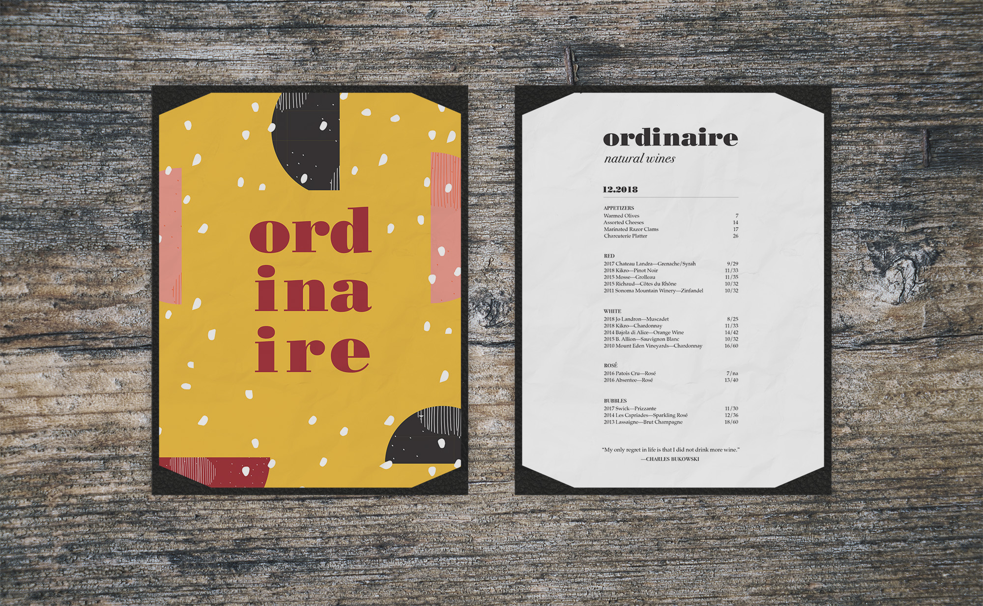
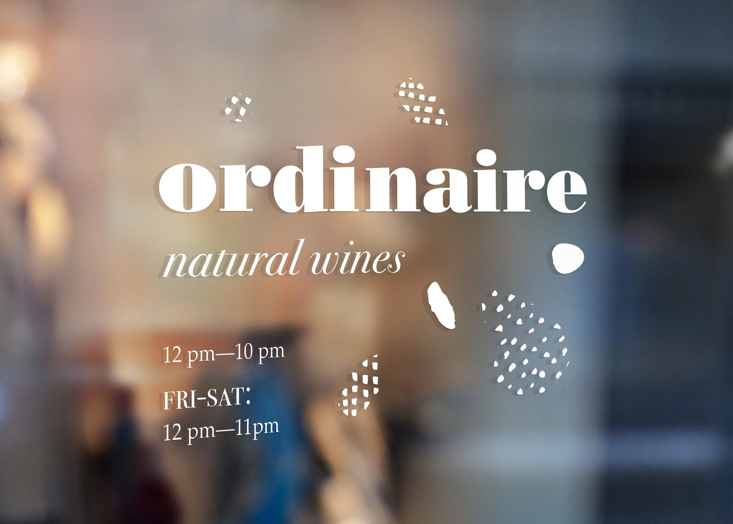
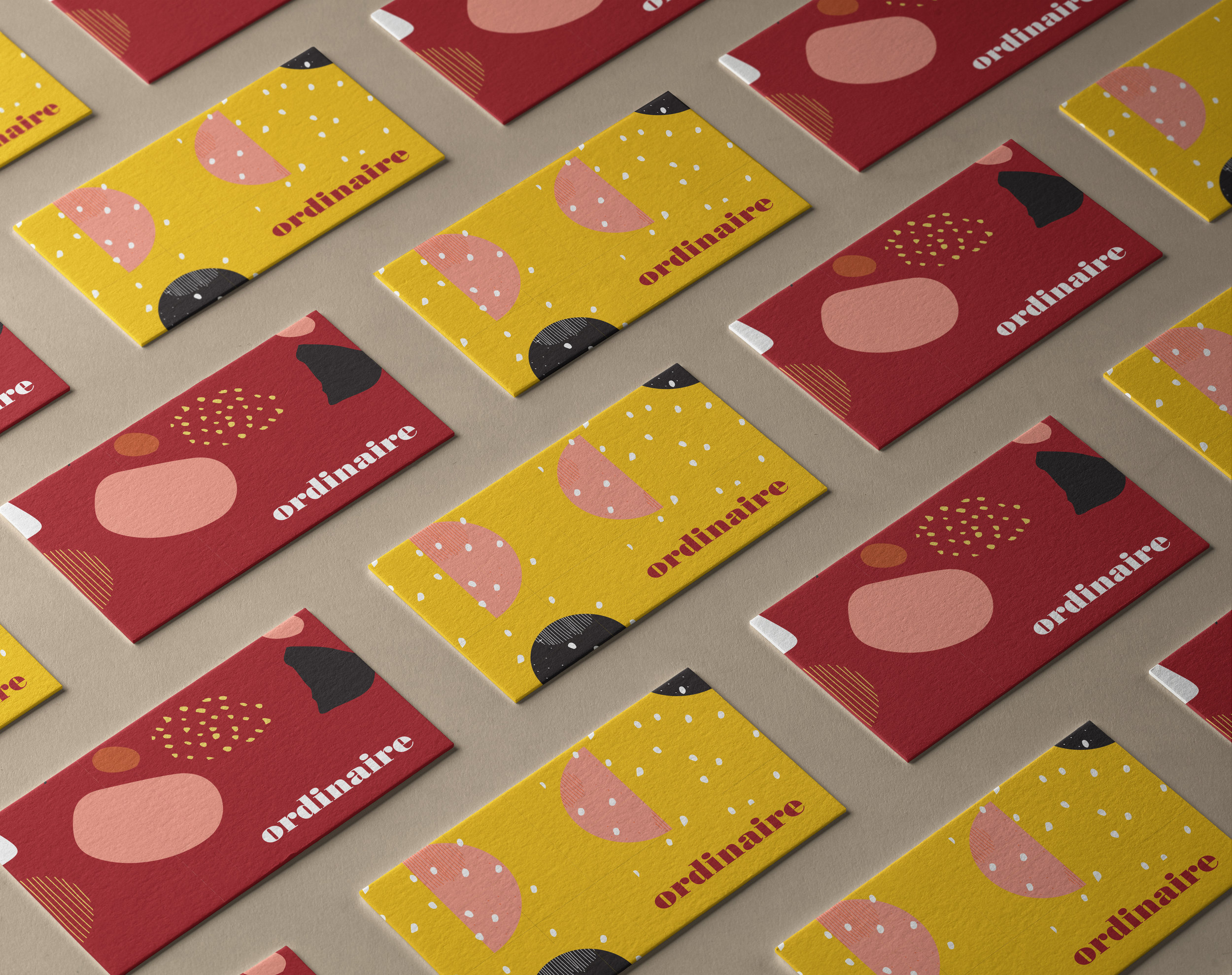
The stars of Ordinaire’s menu—white, red, rosé and champagne—inspired the color palette with a splash of blue for something unexpected. Patterning takes on organic and fluid forms, suggesting gulps of cabernet, the fizz of brut champagne, or legs on the rim of a glass. Three primary patterns complement Ordinaire’s three levels of membership (Club Ordinaire, Club Extraordinaire, and Club Grand Extraordinaire) and their affiliated packaging. Counter to biodynamic and exploratory graphics, straightforward minimal type keeps Ordinaire polished and legible.
“Natural wine continually surprises me. It’s the great joy of drinking to be confounded, confused, surprised, and maybe enlightened. I’m suspicious of repetition—of things that confirm what I already know. I guess you could say natural wine is epiphanic by default.”


